|
|
|
|
Data Entry Basics
Fields, Buttons and Links
Text entry fields
Text fields allow you to type in information.
Sample: 
Drop-down lists
Drop-down boxes allow you to select from a longer list of choices than typically shown with radio buttons or check boxes. Click the down arrow on the right side of the drop-down box. Scoll until your choice is highlighted. Click to select it.
Sample:
Checkboxes
Check boxes allow you to select one or more choices. Click in the box beside each of your choices.
Sample: 
Radio buttons
Radio buttons allow you to select one of a number of choices. Click in the circle (radio button) of your choice. Only one selection can be made.
Sample: 
Buttons
Buttons allow you to take action (search, save, cancel, print, submit), or to navigate (continue, select a specific page).
Sample: 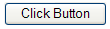
Hyperlinks
Hyperlinks (usually underlined text, often blue) allow you to navigate to another page or to another location in the same page.
Sample: 
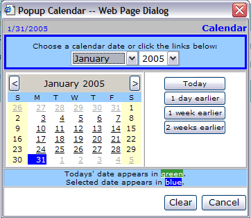
Selecting Display Dates on the Calendar
Dates can be input or selected from a popup calendar. Entry fields for dates are typically shown followed by the calendar icon and the required date format in parentheses.
To use the calendar:
Click the calendar icon . The calendar dialog will appear. Three regions on the calendar allow you to locate the day desired.
Choose the month and year from the drop-down lists at the top
Choose the month and year with the < > arrows on either side of the small calendar heading
Choose one of the date preselects: Today, 1 day earlier, 1 week earlier, or 2 weeks earlier
Click the specific date to select it. The dialog will close and the date will be entered in the date field in the proper format.
Sample: 